Portrait in a cap, in front of a vintage drawer cabinet

Christoph Mandl

I design digital products and brands. All the design work at StärkenEffekt GmbH comes from my desk.

StärkenEffekt

StärkenEffekt makes strengths visible, from family-run carpentry shops to global corporations. It offers an online assessment, team workshops, and coach training.

What I did:
  • Brand design
  • Web design
  • UI design
  • Design system
Design system
UI design
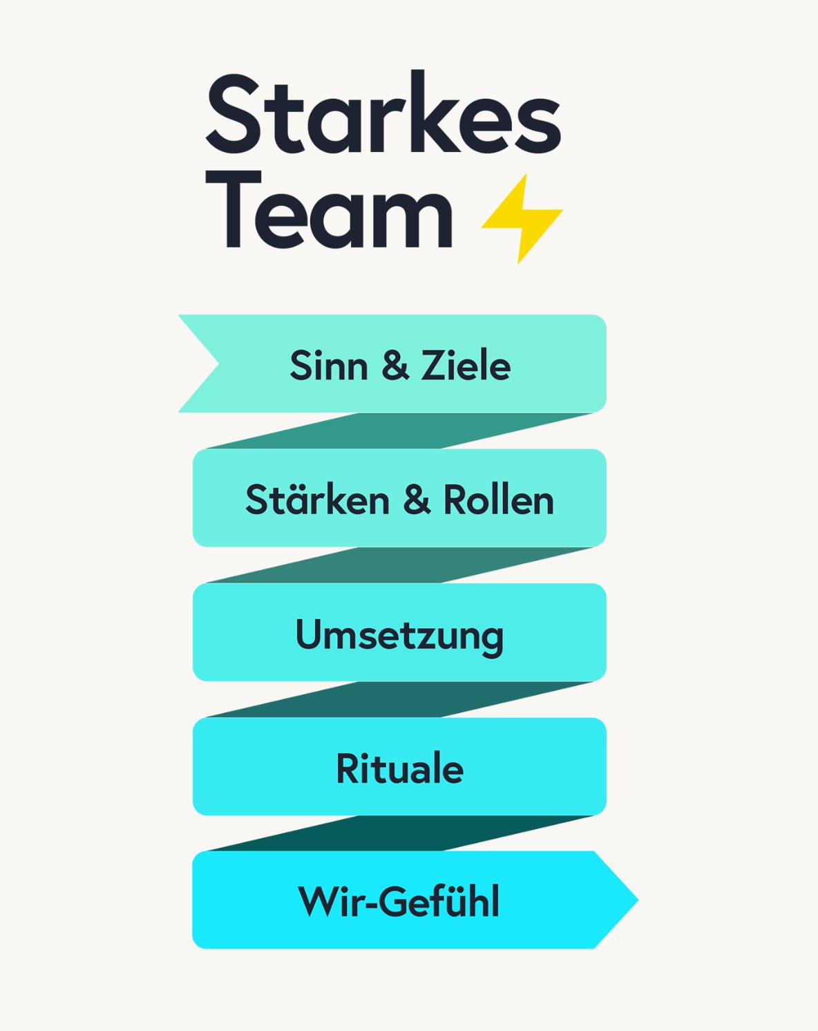
Infographic “Strong Team”: a folded ribbon running from purpose and goals through strengths and roles, implementation and rituals, to team spirit
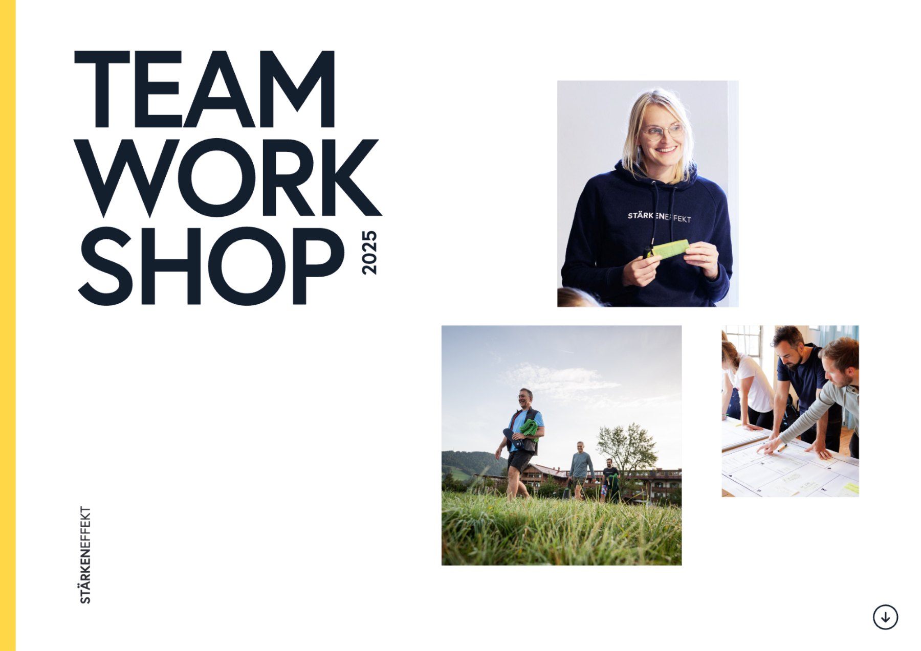
Brochure for the 2025 team workshop: the cover and its three formats, Let’s go, Momentum, and Retreat
Editorial design
The staerkeneffekt.de homepage: “We make strengths visible.”
Web design staerkeneffekt.de
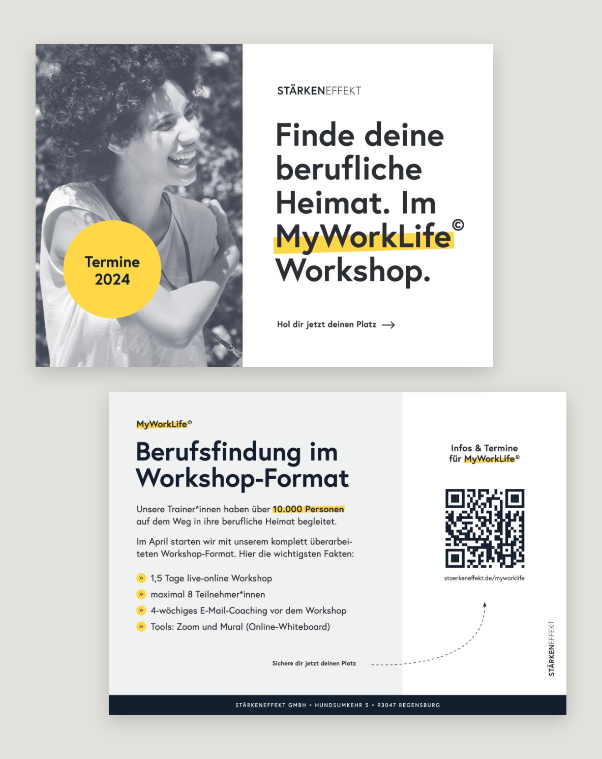
Flyer for the MyWorkLife workshop, front and back
Print design
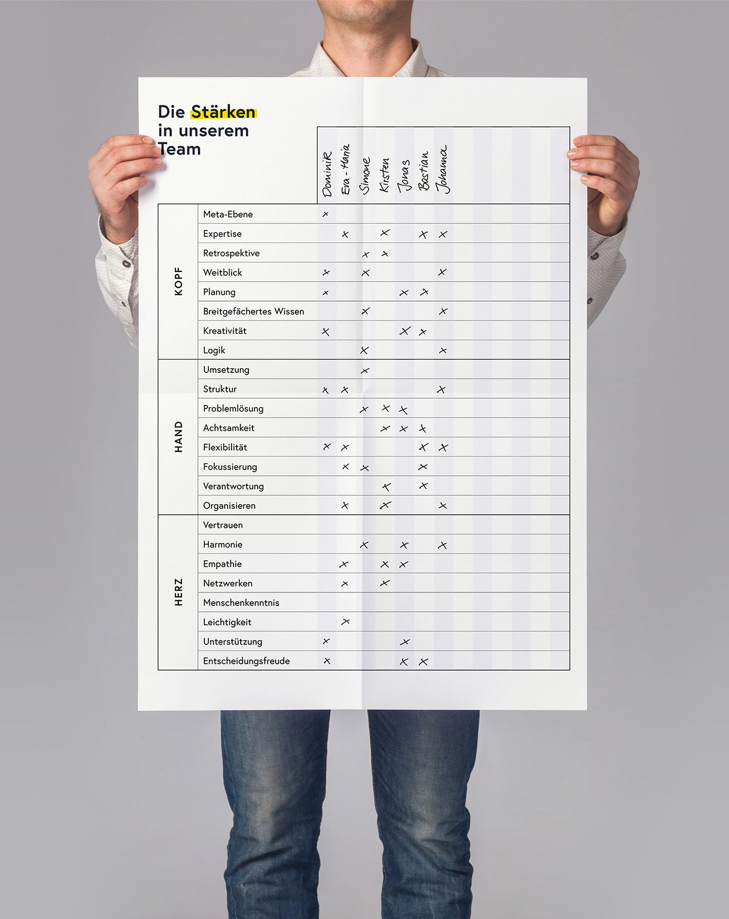
Someone holds up the filled-in poster “The Strengths in Our Team” to the camera
“360° View” report in the StärkenRadar admin dashboard: 509 activated 360° views, activation rate 33.1%, 2,189 responses, viral coefficient 0.40; below, a bar chart of responses per 360° view and the discount code redemption rate
UX design staerkenradar.de
Portrait of a laughing, freckled woman against a light wall in StärkenEffekt’s photo style: black and white with night blue in the shadows
Photo style

Used by

Bosch, Deutsche Bahn, Roche, Siemens Energy

And many more. Over 20,000 people have taken the StärkenRadar test.

Thann Bioleder

What began as a repair shop in Regensburg grew into a maker of organic leather goods, with its own brand and online store.
What I did:
  • Brand design
  • Web design
  • E-commerce design
  • Product design
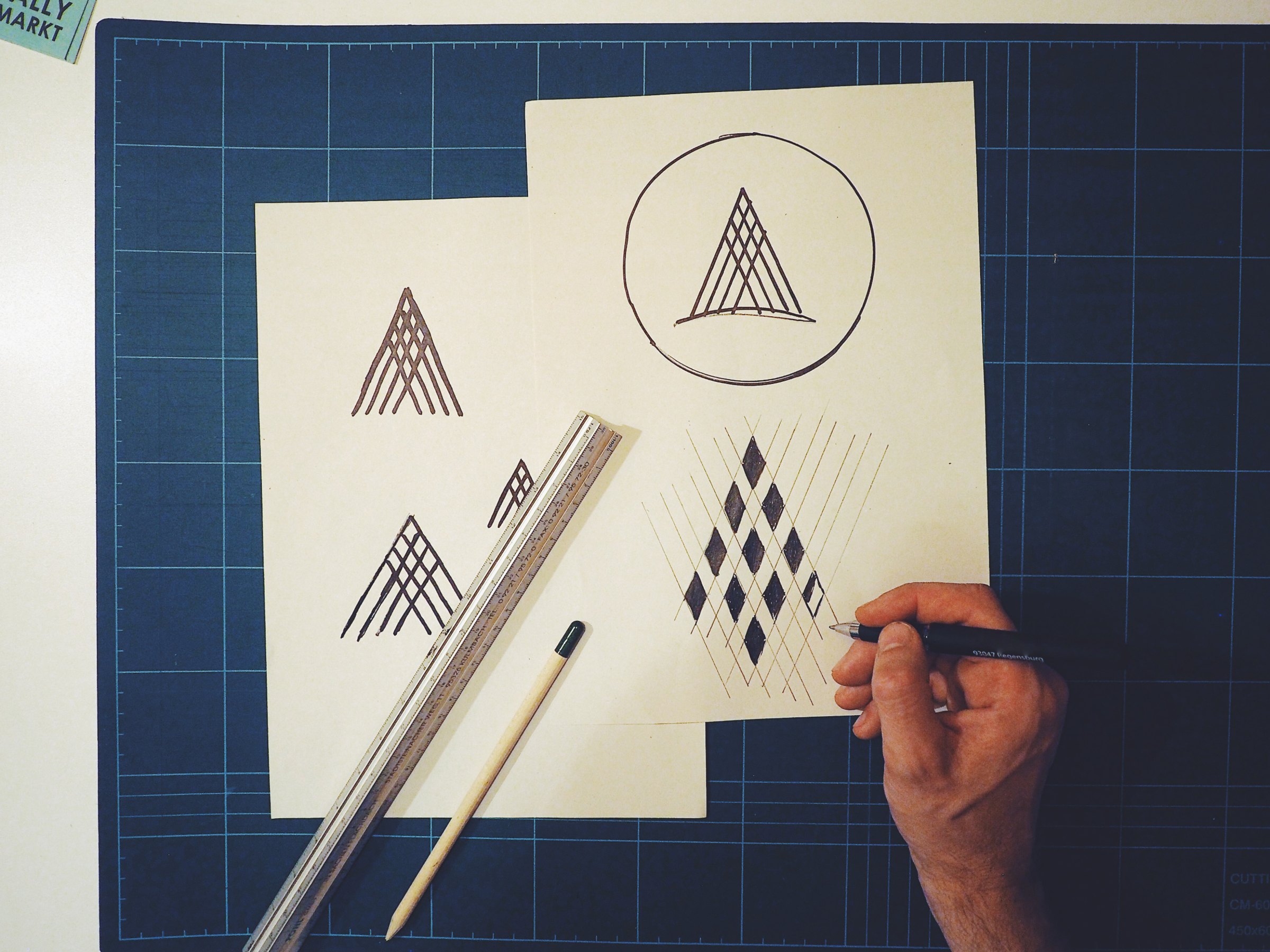
Sketches of the logomark on a cutting mat: a fir tree made of lines, in a circle and as a diamond pattern
Logo design
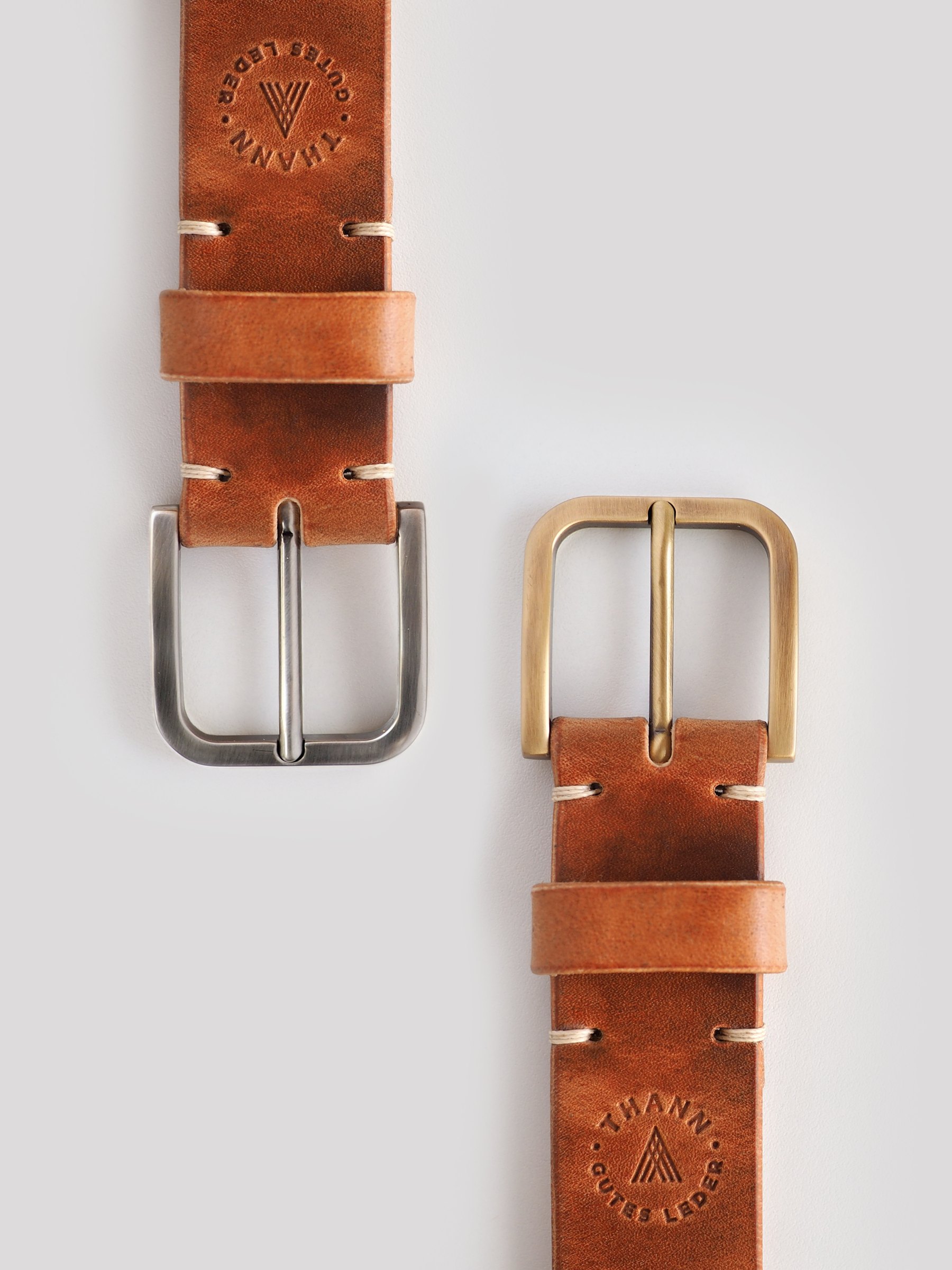
The logo embossed on the belt
Style guide
The logo as a stamp at 25 and 20 mm and as a logomark at 10 mm.
Responsive logo
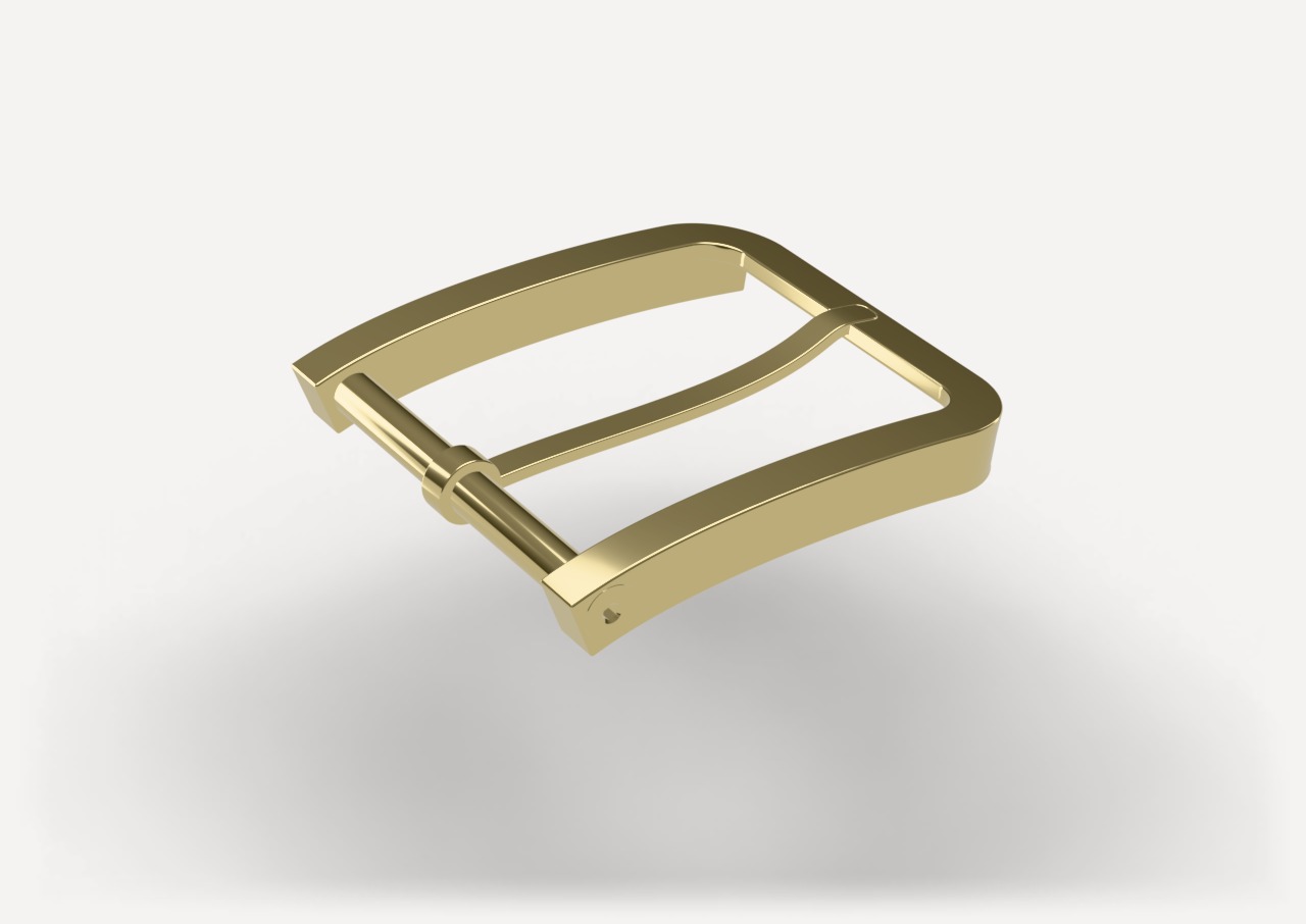
3D model of a brass belt buckle
Product design
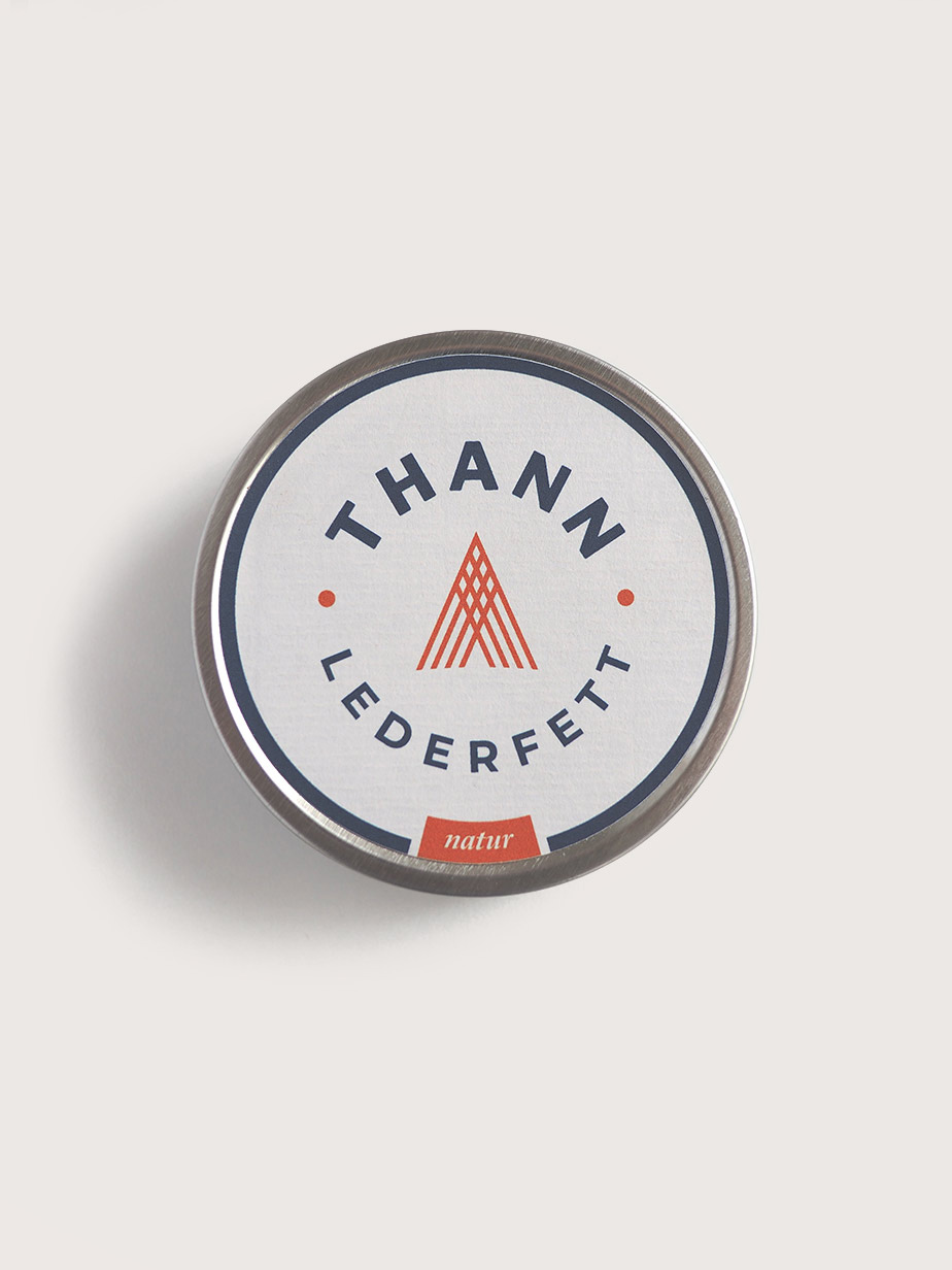
Round tin of Thann leather balm, its label showing the fir tree in fox red
Packaging design
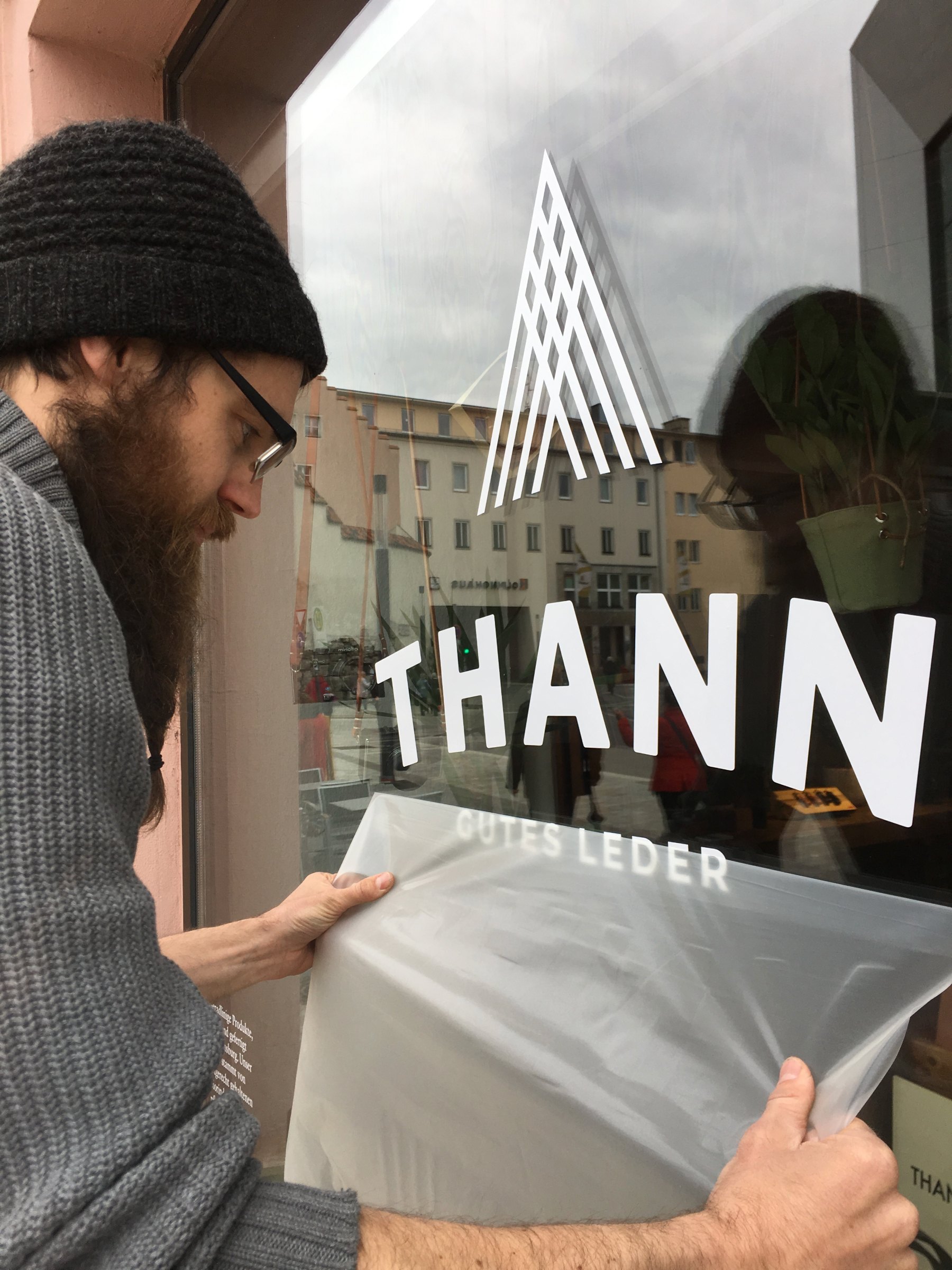
Window lettering for the workshop
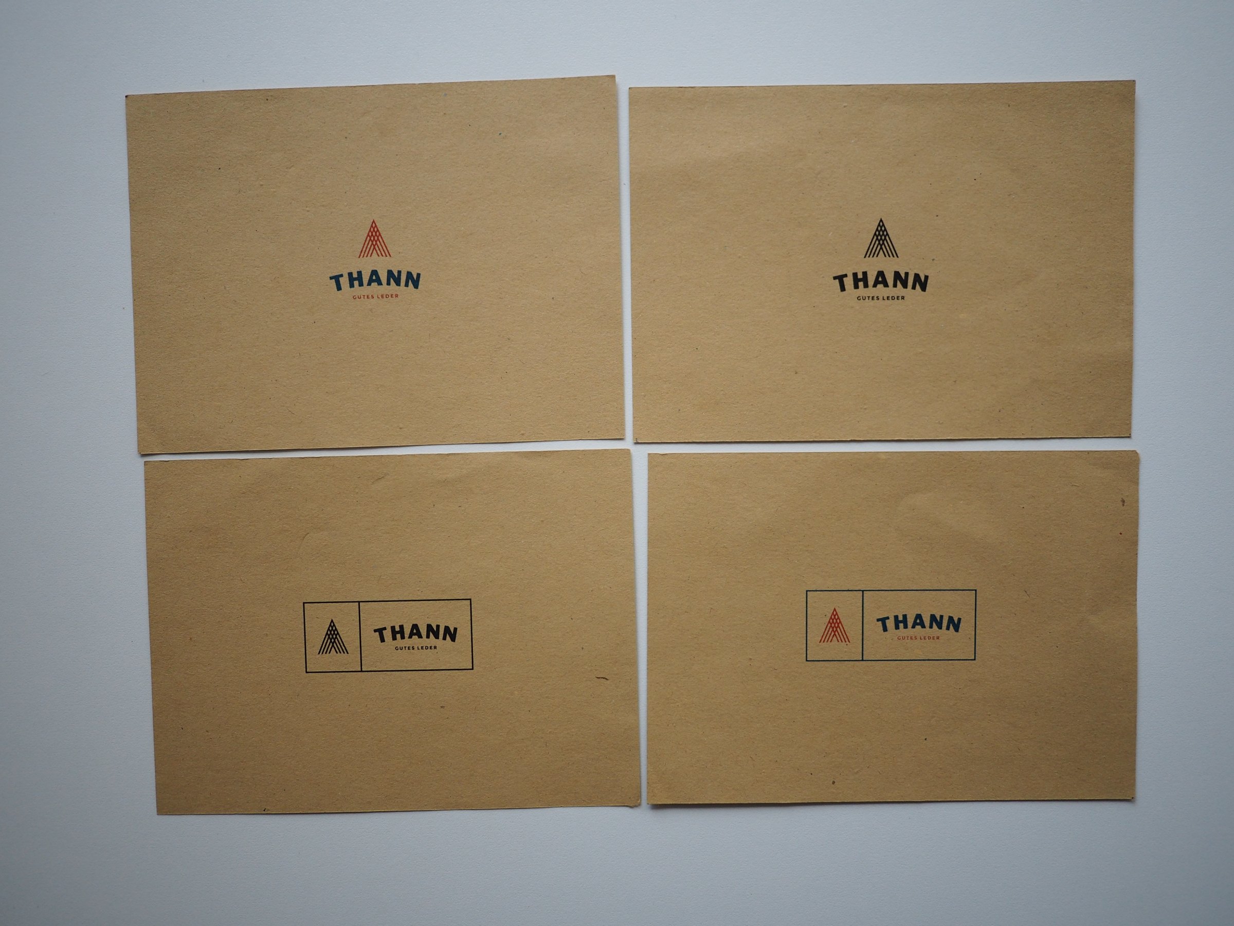
Test print on kraft paper
The thannleder.de homepage: cattle grazing in a pasture, “Real organic leather starts in the pasture.”
Web design thannleder.de
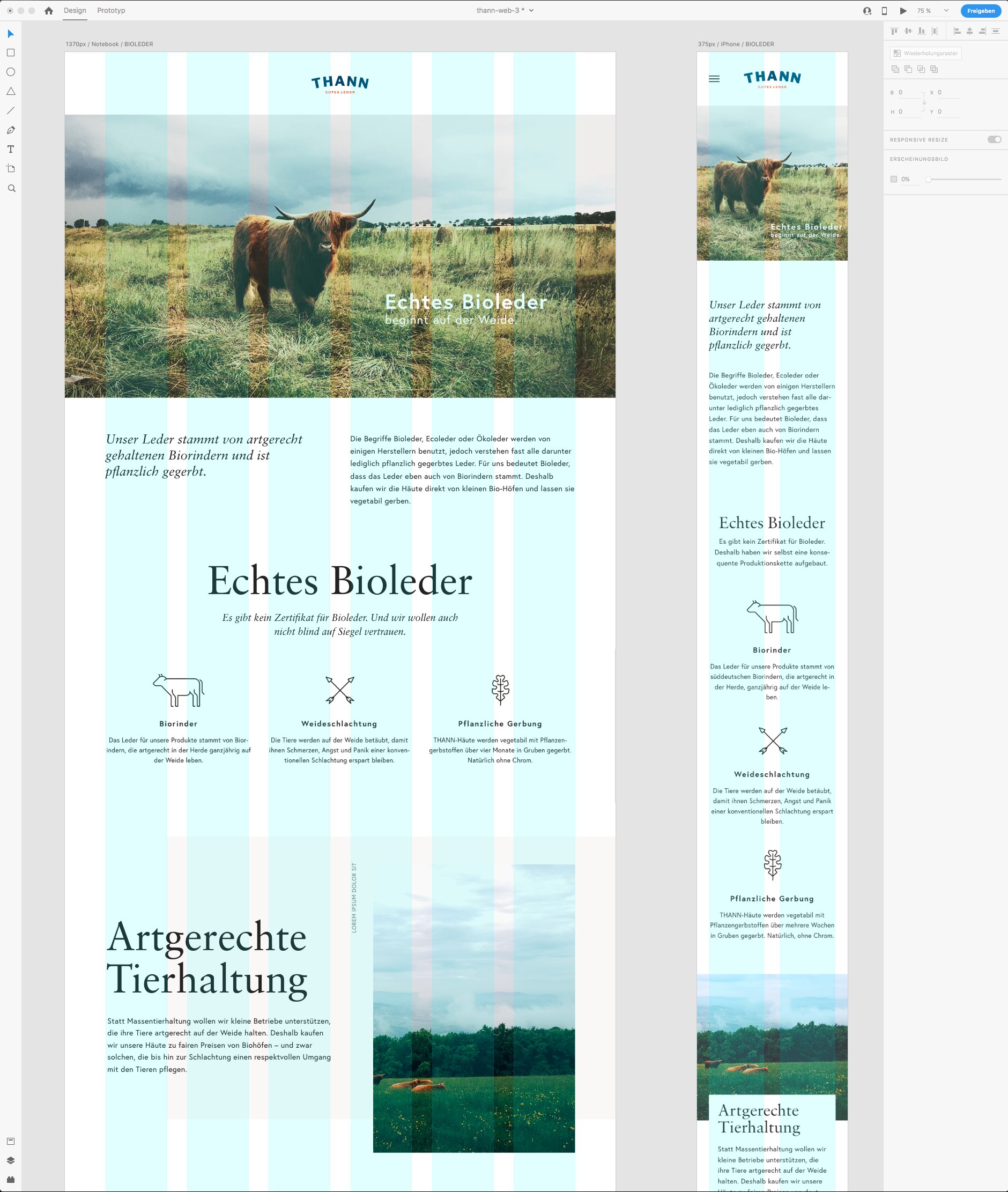
The website designed in XD, shown on a laptop and an iPhone
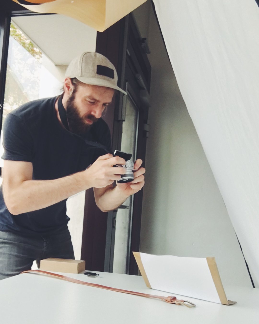
Improvised photo setup: a belt being photographed against white cardboard
Product photography
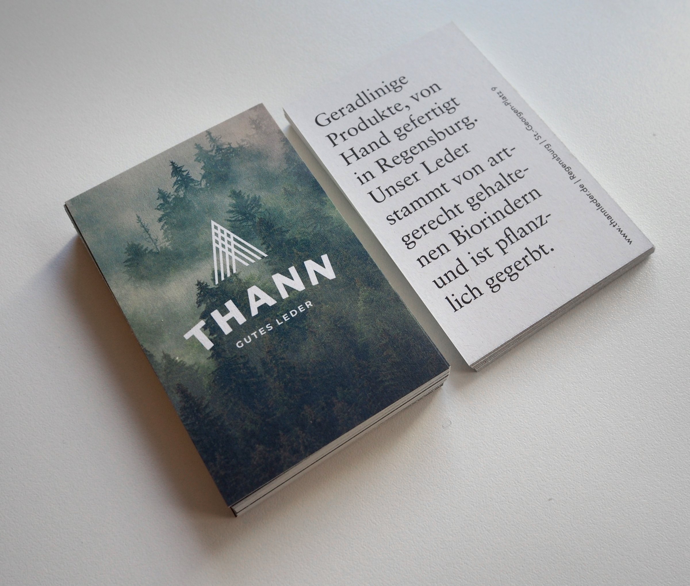
Business cards: on the front, the logomark over a misty fir forest; on the back, a line about the leather
Print design
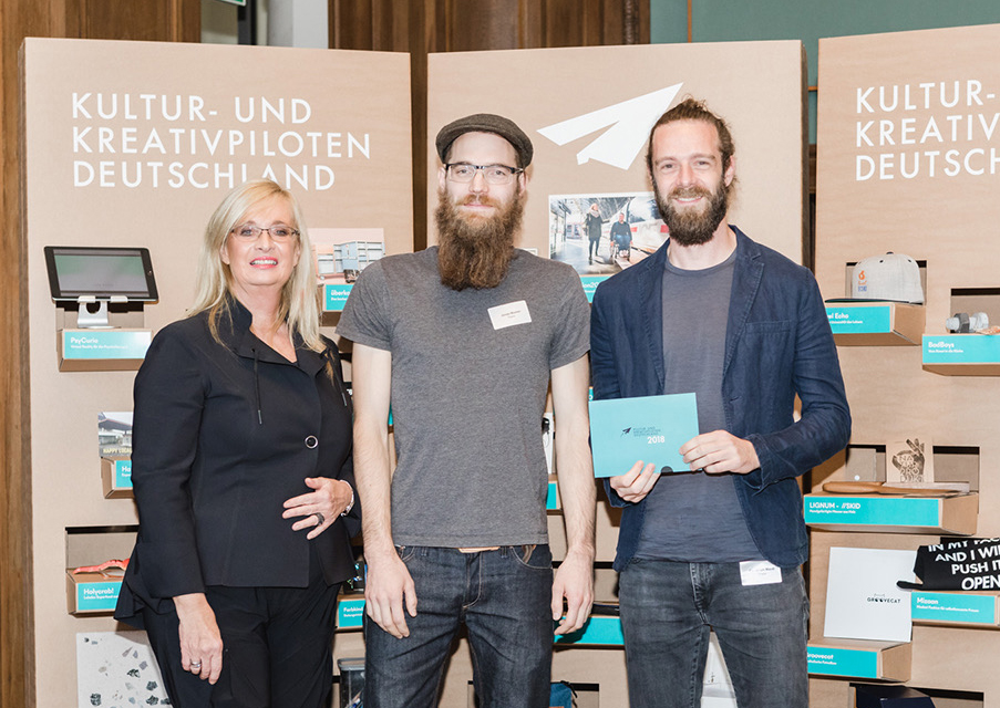
Award ceremony: three people in front of the exhibition wall
Kultur- und Kreativpiloten Deutschland 2018

Exhibited at

Positive Space: Corporate Design

Degginger, Regensburg, September to December 2019. Chosen from more than 80 entries.

Brenner Cycles

A Regensburg bike maker that built the most beautiful bike in town, in a limited run of 50.
What I did:
  • Brand design
  • Web design
  • Product design
  • Photography
  • Labor of love
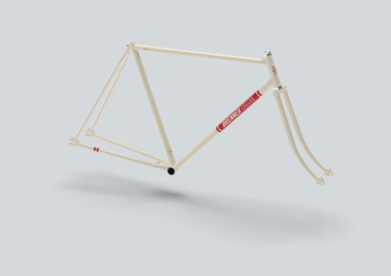
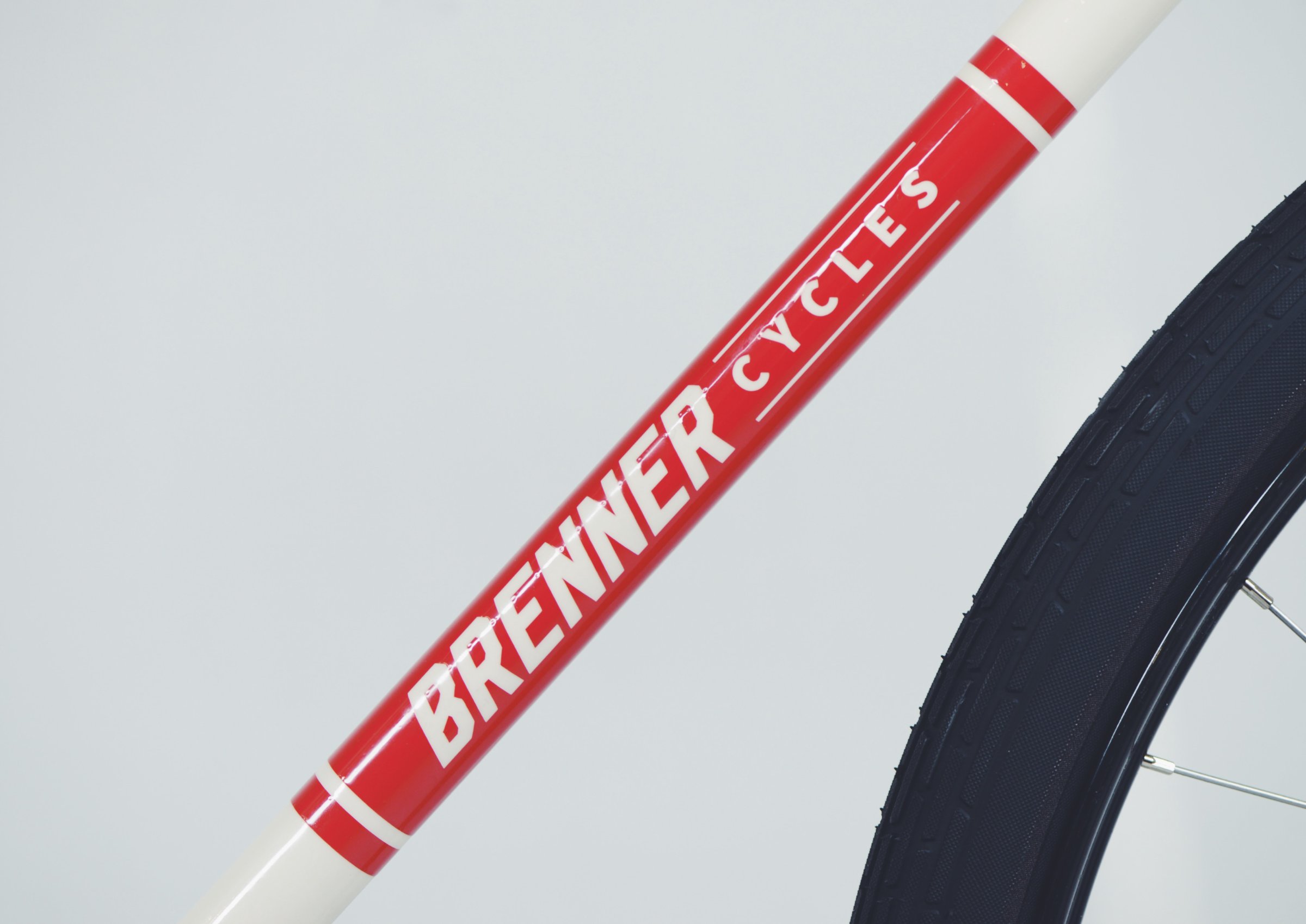
The logotype as a decal on the down tube
Brenner Cycles logo: two arcs above the logotype, white on red and black on white
Logo design
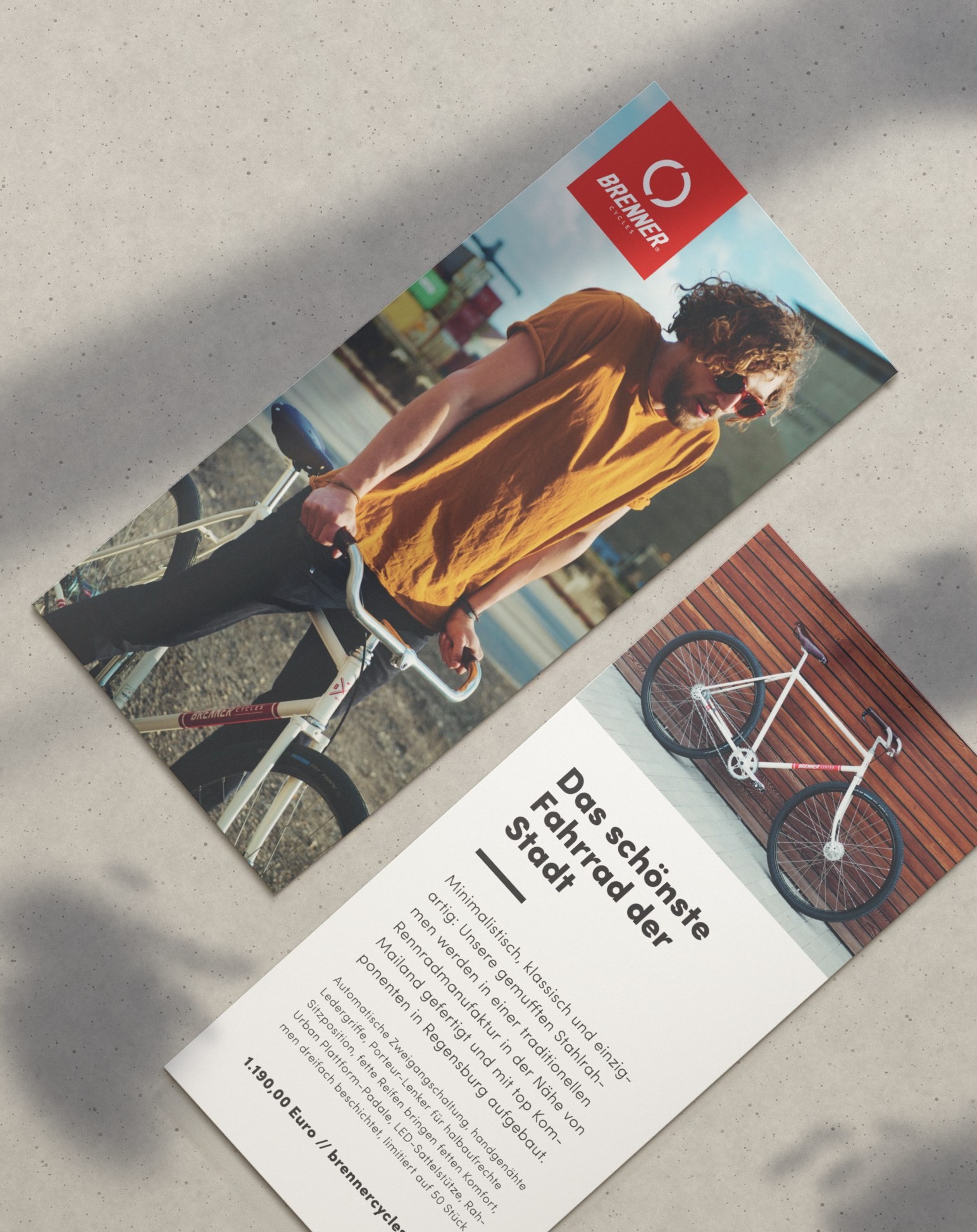
Brenner Cycles flyer: on the front, a rider and bike; on the back, “The most beautiful bike in town”
Print design
The brennercycles.de homepage: a rider and bike next to the logo
Web design brennercycles.de
3D model of a cream bicycle frame with a red logotype
Product design
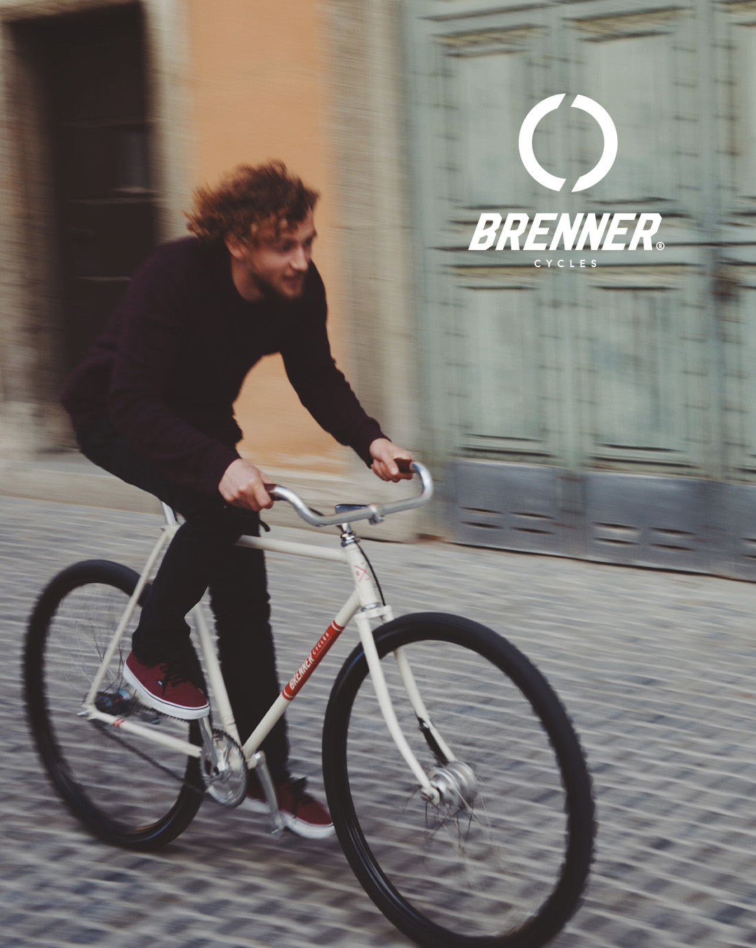
A cyclist on the cream bike crossing cobblestones, with the logo in the top right corner